IADI Image
Metadata
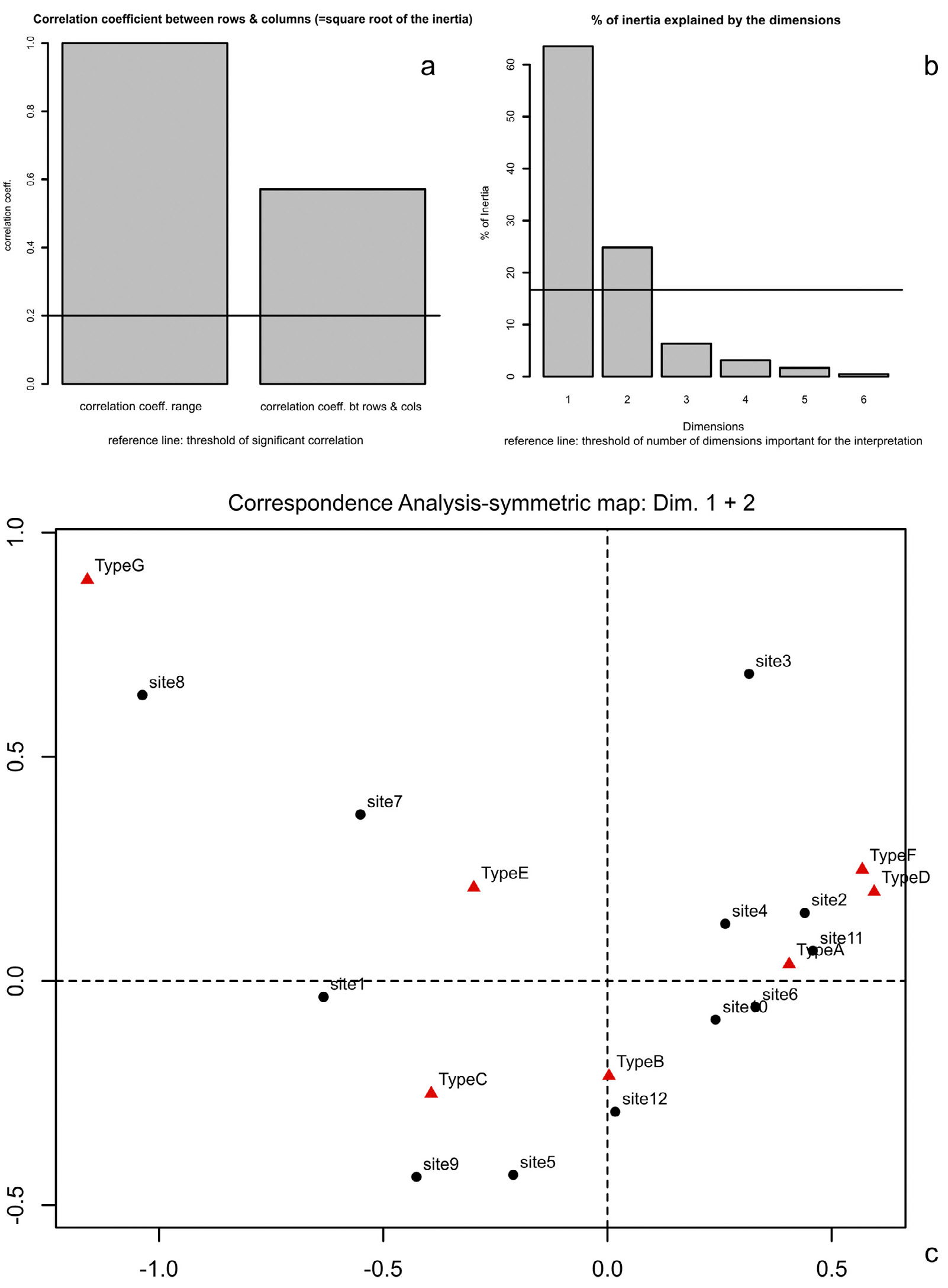
| Caption | CA on data of Tab. 1. Charts provided by the R script. a) Bar chart showing the coefficient (right) for the correlation between rows and columns of the table. A reference line indicates the threshold of “significant” correlation. b) Bar chart showing the percentages of inertia explained by the CA dimensions. A reference line suggests the threshold above which a dimension should be considered important for data interpretation according to the average rule. c) Symmetric map of CA on Tab. 1, showing the first 2 dimensions (from the “ca” package). |
| Figure number | 1 |
| Article | An R script to facilitate Correspondence Analysis. A guide to the use and the interpretation of results from an archaeological perspective |
| Authors | Alberti G. |
| Volume | Volume 24 |